Sunday, March 31, 2019

GIS 4006 - Module 10 - Dot Mapping

For this weeks module 10 we were tasked with creating a dot density map of South Florida based on information supplied by the U.S. Census Bureau. Dot density mapping involves the use of dots as symbols to identify one or more occurrences. In the case of my map 1 dot is equivalent to 20,000 people. The number of dots change in proportion equivalent to the population field in the supplied census data excel file.

The major advantage of dot mapping is that it is an intuitive concept that a viewer with no map experience can comprehend. A quick glance at the legend to confirm the dot symbol representation and a viewer can see on the map where dots are grouped closely and where they are spread apart. These areas would intuitively register as high and low population areas to an individual with no mapping experience. Another advantage is that dot mapping shows how land is used. In the case of a population map high concentrations of dots indicate a highly populated.

Disadvantages to dot mapping would involve the appearance of the dots themselves. Dots that are weighted to low would barely be visible and dots weighted to high would overlap and obscure. Dots can also be misunderstood if a viewer does not acknowledge the legend. A single dot could be understood as being equivalent to a single person in the case of a population dot density map like in this module.


Saturday, March 23, 2019

GIS 4006 - Module 9 - Flowline Mapping

For this weeks module 9 we were instructed to create a flowline map that highlights the immigration values for each continent of the worlds total immigration to the United States for 2008. This data was supplied by the US Department of Homeland Security. The type of flowline map that I created falls under the category of distributive flowline maps. This type of map handles data that is quantitative such as immigration values. Using adobe illustrator I was able to customize this flowline map with many appearance and style effects such as, inner glow effects to title and flowlines, 3d extrude and bevel effects to flowlines, and drop shadow effects to flowlines and continents. All of these effects allow for better visualization of map elements. Other essential map elements were added while adhering to cartographic design principles.


Sunday, March 10, 2019

GIS 4006 - Module 8 - Isarithmic Mapping

For this weeks lab, module 8, we were tasked with creating a map that utilizes continuous tone and hypsometric tinting in order to display precipitation data for the state of Washington over a period of 30 years. 
A continuous tone symbology is one that is classless and represents individual points as colors or tones corresponding to values. This symbology is implemented into the Washington Precipitation map as square inches of rainfall with orange tones indicating low values and blue tones values indicating high values.
Hypsometric tinting is a symbology method for enhancing elevation. By assigning colors or tones to contour lines or lines of equal elevation relief can be visualized easier. Colors chosen are typically tones or shades for ground cover found at that given elevation. 
The PRISM group at Oregon State University compiled this point based data set for the entirety of Washington state from 1981 - 2010. The attached map was created utilizing arcgis pro and includes all essential map elements while taking into account cartographic design principles. 


Sunday, March 3, 2019

GIS 4006 - Module 7 - Choropleth Mapping

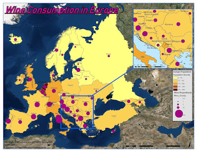
For this weeks Module 7 we were tasked with creating a choropleth map for wine consumption in Europe. A choropleth map is a themetic map in which areas are shaded or patterned according to a their measurement value. For this map population density for Europe is represented by an orange color gradient scale with lighter colors representing lower pop. dens. values and darker colors representing higher pop. dens. values. I chose a manual interval classification method as I was able to set the class ranges based on attribute table data. Wine consumption is represented by a proportional symbology scale where smaller purple circles represent low wine consumption and larger purple circles represent high wine consumption. Utilizing arcmap and adobe illustrator I was able to apply these two forms of symbology along with all necessary map elements. I found arcmap to be more useful than arcgis pro when it came to labeling the countries as arcmap was able to perform labeling far faster than arcgis pro.


Spring 2023 semester wrap up

 The spring 2023 semester at UWF has been an eventful one in which I finalized the requirements for my bachelors of science in natural scien...