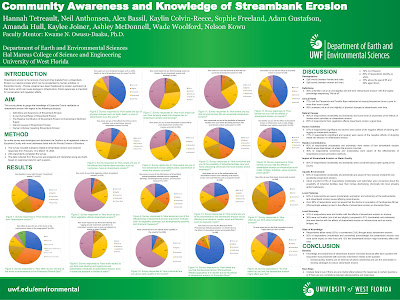
The spring 2023 semester at UWF has been an eventful one in which I finalized the requirements for my bachelors of science in natural science. Two courses that I have taken this semester have been Community Engagement (EVR4039) & Coastal Morphology (GEO4221). While these two courses were not necessarily GIS courses they both incorporated themes and elements that definitely resonated with GIS. In Community Engagement we developed and distributed a community awareness survey involving streambank erosion through a web-based survey platform known as Qualtrics. The goal of the survey was to assess Escambia county resident's knowledge and awareness on a number of topics involving streambank erosion in hopes to establish a framework for future decision and policy makers in implementing future streambank erosion prevention strategies. We presented our survey project as a poster presentation at the student scholar symposium and were awarded the Best Research (with faculty) Project award at the High-Impact Practice Faculty showcase.


For my final project in Coastal Morphology I wrote a literature review that covered the progression of GIS in the field of coastal morphology. The paper covered predecessors to GIS, it's inception, present applications and trends, and future predictions.
The Progression of GIS in the Field of Coastal Morphology