
Sunday, March 3, 2019
GIS 4006 - Module 7 - Choropleth Mapping
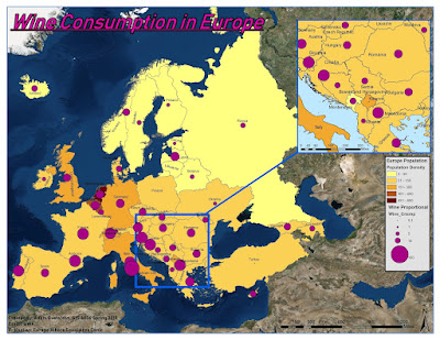
For this weeks Module 7 we were tasked with creating a choropleth map for wine consumption in Europe. A choropleth map is a themetic map in which areas are shaded or patterned according to a their measurement value. For this map population density for Europe is represented by an orange color gradient scale with lighter colors representing lower pop. dens. values and darker colors representing higher pop. dens. values. I chose a manual interval classification method as I was able to set the class ranges based on attribute table data. Wine consumption is represented by a proportional symbology scale where smaller purple circles represent low wine consumption and larger purple circles represent high wine consumption. Utilizing arcmap and adobe illustrator I was able to apply these two forms of symbology along with all necessary map elements. I found arcmap to be more useful than arcgis pro when it came to labeling the countries as arcmap was able to perform labeling far faster than arcgis pro.
Subscribe to:
Post Comments (Atom)
Spring 2023 semester wrap up
The spring 2023 semester at UWF has been an eventful one in which I finalized the requirements for my bachelors of science in natural scien...
-
 This weeks introduction lab laid the foundation for building my ArcGIS mastery. The overview lesson delved into the basics of the software...
 -
 For the summer semester of 2022 I have enrolled in GIS 4102 to better understand the ins and outs of programming in GIS. We began interacti...
 -
 This weeks module 11 had us mastering the art of 3 dimension feature creation utilizing Arcgis Pro and then transferring data into Google Ea...
No comments:
Post a Comment