Sunday, April 14, 2019
GIS 4006 - Module 12 - Neocartography & Google Earth
A discussion post was made by me in regards to the future of GIS and volunteered graphic information.
GIS as a science is continuously evolving as more and more users become active participants in GIS data gathering techniques. One of such techniques is volunteered graphic information, VGI. This geospatial data is being uploaded by an enormous amount of people via the internet at an ever increasing rate. I personally am a fan of VGI and any improvements in general to GIS sciences and applications but it must be noted that VGI comes with some drawbacks, such as data integrity. Some work arounds to inaccurate public data could involve an administrative review or peer review process. I could see a system that implemented a ranking system based on data quality being a good source of VGI content.
Saturday, April 6, 2019
GIS 4006 - Module 11 - 3D Mapping
The first part of this module involved completing a 3d Visualization Using ArcGIS Pro course on ESRI's website. This training course gave a great overview of 3d mapping basics and walked me through three exercises involving: Craterlake, Oregon , Downtown San Diego with extrusions rendered as non realistic and realistic from different view points.
A Boston buildings feature file was then extruded to have elevation values. This was achieved by generating random points within the building shapefile (34,300 points), adding surface (elevation) information to those points, and summarizing per building (100 points per
building, 343 buildings). This generated a 3d feautre scene of the cityscape of Boston that was saved as a KMZ file and uploaded into Google Earth Pro.
Importing 3d layers into Google Earth has many useful applications but two that come to mind would be construction projects and delivery routes for businesses. Utilizing Arcgis pro to convert 3d scene features to KMZ files and uploading them into Google Earth would be an easy way to get information out to potential clients or customers that do not have access to gis specific software, such as arcgis pro. Google earth is accessible by anyone for free and has a much simpler user interface learning curve when compared to arcgis applications.
Finally a comparison of Charles Joseph Minard's map-graph was conducted on the original and a 3d representation of Napoleon's march to Moscow. The original shows the decreasing size of the Grande Armée as it marches to Moscow using a clever use of mapping techniques to not only show a geographic representation of where Napoleons army marched to, from Kowno to Moscow, but it also shows a symbolic representation of the size of the army through the use of diminishing weight. When viewed in 2d and 3d these elements are apparent, but 3d presents this information in a more dramatic way. Giving the army route a Z value allows a user to view the decline of Napoleon’s army in weight thickness and in depth, all from a birds eye view. The 3d map definitely pulls off an effective theme but it should be noted that the 2d map presents a far more legible account with more details, such as river names, city names, and temperature all being visible at a glance. I personally prefer the original 2d map by Minard.
Sunday, March 31, 2019
GIS 4006 - Module 10 - Dot Mapping
The major advantage of dot mapping is that it is an intuitive concept that a viewer with no map experience can comprehend. A quick glance at the legend to confirm the dot symbol representation and a viewer can see on the map where dots are grouped closely and where they are spread apart. These areas would intuitively register as high and low population areas to an individual with no mapping experience. Another advantage is that dot mapping shows how land is used. In the case of a population map high concentrations of dots indicate a highly populated.
Disadvantages to dot mapping would involve the appearance of the dots themselves. Dots that are weighted to low would barely be visible and dots weighted to high would overlap and obscure. Dots can also be misunderstood if a viewer does not acknowledge the legend. A single dot could be understood as being equivalent to a single person in the case of a population dot density map like in this module.
Saturday, March 23, 2019
GIS 4006 - Module 9 - Flowline Mapping
Sunday, March 10, 2019
GIS 4006 - Module 8 - Isarithmic Mapping
A continuous tone symbology is one that is classless and represents individual points as colors or tones corresponding to values. This symbology is implemented into the Washington Precipitation map as square inches of rainfall with orange tones indicating low values and blue tones values indicating high values.
Hypsometric tinting is a symbology method for enhancing elevation. By assigning colors or tones to contour lines or lines of equal elevation relief can be visualized easier. Colors chosen are typically tones or shades for ground cover found at that given elevation.
The PRISM group at Oregon State University compiled this point based data set for the entirety of Washington state from 1981 - 2010. The attached map was created utilizing arcgis pro and includes all essential map elements while taking into account cartographic design principles.
Sunday, March 3, 2019
GIS 4006 - Module 7 - Choropleth Mapping
Sunday, February 24, 2019
GIS 4006 - Module 6 - Data Classification
Sunday, February 10, 2019
GIS 4006 - Module 4 - Cartographic Design
Sunday, February 3, 2019
GIS 4006 - Module 3 - Typography
The theme for this map is as follows; Font: Berlin Sans FB Demi Bold, Size: 18, Color:Town-Yellow, Airport-Red, Statepark-Green, Countryclub-Blue, Stroke: White. All features for this module were labeled using this technique with varying font size/color and leader lines. Leader lines, for this map, were drawn with the pen tool in adobe illustrator and the type on a path tool was used to type Font: Berlin Sans FB Demi Bold, Size: 12, Color: Aerial-Black and Hydrographic-Italicized Blue, into the corresponding features GPS coordinate locations.
Features that make my map unique would be a drop shadow applied to the marathon islands feature layers, a color coded font that aids in the location of Town, Airport, Statepark, and Country Club features accompanied by a color coded legend, and, finally, an aesthetic use of symbols, colors, and border frames to highlight a beautiful area such as Marathon, Florida.
Friday, January 25, 2019
GIS 4006 - Module 2 - Intro to Adobe Illustrator
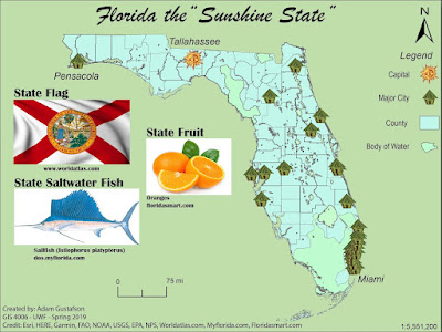
I used scripts in this lab exercise to replace all major cities symbols with the symbol for a primitive hut. I did this by selecting both the major cities object and the hut object from the layers panel and ran the supplied script. I also applied this same method to the capital object in order to replace it with a primitive sun symbol.
I added a 1.0 neatframe by drawing a rectangle and adjusting the stroke width and color. I also added a drop shadow to my counties object by selecting it in the layers panel and then choosing the effect tab > stylize > and drop shadow. I added images of Florida’s state flag, salt water fish, and fruit from the web. A custom north arrow was chosen from ArcGIS symbols and a legend was created with corresponding map symbols and elements.
Friday, January 18, 2019
GIS 4006 - Module 1 - Map Critique
Well-designed Map
Title: National Elevation Data Set Shaded Relief of the United States
Author: United States Geological Survey (USGS)
Theme: Elevation for the United States
1. Graphical excellence is the well-designed presentation of interesting data – a matter of substance, of statistics, and of design.
precision, and efficiency.
Sunday, January 13, 2019
GIS 4006 - Introduction
I have a bit of experience with the GIS program here at UWF and I can say that, overall, it has been a pleasing and challenging learning experience. In fact, the last project I did for special topics involved mapping food desert areas for Navarre, Fl which was interesting to apply GIS skills to learn something about my own home town.
My future goals involve pursuing a masters and eventually a job related to Geology/GIS for the U.S. Geological Survey.
Here's a link to my Story Map (Links to an external site)
Tuesday, December 11, 2018
GIS 4930 - Project 4 - Navarre Food Desert Analysis
A food desert can be described as an area in a community that has succumbed to health degradation as a result of no nearby nutritional sources.
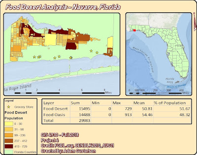
For the final portion of Project 4 we were tasked with assembling all of our food desert data into one concise power point presentation dedicated to highlighting our food desert area and illustrating how it is effecting the community. I chose my hometown of Navarre, Florida for the study area to my Food Desert Analysis. Navarre is approximately 84.83 square miles in area and 9 grocery stores were identified for this analysis.
GIS programs involved in this analysis included utilizing: ArcMap, Qgis, Leaflet, and Mapbox. Methods involved creating shapefiles for food deserts and grocery stores in Navarre. Shapefiles were uploaded into Mapbox as tilesets and displayed in Leaflet. Arcmap was used to create the study area map. The most challenging technique in this project involved having to create the Navarre food desert shape file. A new Near.csv to reference object id’s within 1 mile and unique to Navarre had to be created along with a new set of centroids.
The data being displayed indicates that grocery stores in Navarre are restricted mainly to highway 98. This restriction creates food deserts the farther north you travel from highway 98. I used my local town and the data does not surprise me. I knew that most grocery stores were located either directly on highway 98 or within at least 1 mile.
Food Desert = 51.67 % of total population
Food Oasis = 48.32 % of total population
From these results one might conclude that Navarre is suffering from a food desert issue but this is not necessarily true. Yes the majority of land cover in Navarre is designated as food desert but the accessibility of highway 98 needs to be taken into account. All of these grocery stores are located less than a mile from highway 98 the main life line of Navarre. The accessibility of these grocery stores allows for Navarre to not be effected as drastically by food desert areas in regards to health and well being.
Navarre is a rapidly growing tourist driven town. There is no way that Navarre is suffering from negative health effects brought upon by inner community food desert intensification. This analysis has revealed that Navarre is majority food desert by total population but the accessibility of grocery stores off sets these food deserts by being located directly on Highway 98, the life line of the Gulf Coast. This analysis has shed light onto areas that can potentially benefit from grocery store construction in Navarre, Florida but like I said before Navarre is not under a food desert threat.
GIS 4035 - Final Project - Estuary Comparison - Sediment Deposition
For the final project of Photo Interpretation and Remote Sensing we were tasked with performing manual or automated image processing techniques on remotely sensed data. The landsat imagery for this project was
obtained from USGS.com utilizing their GIS database known as Earth Explorer. The imagery I chose was captured by the Sentinel
II satellite. Preprocessing techniques for this project
involved clipping, scaling and visualizing the imagery to assess for estuary
location, bay shape, water color gradient, and tidal influx/outflux.Programs utilized to perform this analysis included
Erdas Imagine and ArcMap. Utilizing Erdas Imagine I was able to perform a
supervised classification for the study areas of Pond 6 and Saultsman Cove.
Utilizing ArcMap I was able to create the following map deliverable, a combination of two maps showing study area, supervised classification,
state extent, and spectral Euclidean distance for the two selected estuaries.
An overall dark Euclidean distance output being indicative of pixels that have
a higher likelihood of being classified correctly. My map, displayed below,
contains not only all deliverable map elements including scale bar, north
arrow, study area extent, legends, credit, and author, but also class area and
total area derived from tables created and imported from Excel after analyzing
attribute table data added in Erdas for each respective study area. In conclusion, I found this project to be an
accurate assessment for testing an array of GIS skills related to land use land
classification. In performing this sediment deposition analysis I have learned
that by analyzing pixel coloration one can determine sediment deposition
accurately. Sediment deposition rate was assessed for by analyzing the area
values for high, medium, and low sediment classifications for each respective
study area, and Pond 6 was found to have a higher chance at silling up the
quickest.
Friday, December 7, 2018
GIS 4930 - Project 4 - Analyze 2- Food Deserts
I obtained my data using www.fgdl.com I searched florida census and downloaded
http://students.uwf.edu/atg6/GIS/navarre_fooddesert.html
Friday, November 30, 2018
GIS 4930 - Project 4 - Analyze - Food Deserts
For this weeks portion of Project 4 we were tasked with taking the food desert and grocery store shape file data we created last week and uploading them into two open source web map making programs, Mapbox and Leaflet.
Using mapbox I was able to design a layout with a graduated symbology split into five classes based on fooddesert.shp's pop2000 field.
Using the quickstart guide, and the project procedures I was able to create a marker displaying 2 text lines, a circle in a food oasis area, and a 4 coordinate polygon in a food desert area.
Some problems that I ran into over the course of this weeks project include: not being able to locate the correct mapbox to leaflet link required to transfer the maps tileset. Therefore my fooddeserts and grocerystores files are not displayed on my leaflet map.
Link to mapbox map displaying tileset
Friday, November 23, 2018
GIS 4930 - Project 4 - Prepare - Food Deserts
"food desert"
an urban area in which it is difficult to buy affordable or good-quality fresh food.
-dictionary.com
For this weeks portion of project 4 we were tasked with preparing two maps, using Qgis , showing areas in Escambia county that would be considered food areas or food deserts. Areas were subjected to a proximity selection based on nearness to grocery stores. The following deliverables were created in qgis: a map showing Escambia county and UWFs location and a map showing food deserts and food oasis with the project 4 study area as background. The following population statistics were calculated : food desert 60.14% of total pop, food oasis 39.85% of total pop.
Tuesday, November 13, 2018
GIS 4035 - Module 10 - Germantown, MD - Supervised Classification
The attached map deliverable highlights the 8 feature categories and their corresponding areas in square miles. The Spectral Euclidean distance map shows a representation of spectral Euclidean distance with brighter areas being represented as values with a larger pixel difference thus having a higher likelihood for wrong classification. The inset spectral Euclidean Distance map is overall dark indicating correct classification.
Wednesday, November 7, 2018
GIS 4035 - Module 9 - Unsupervised Classification
UWFclass50.img was created with the following settings : classes 50, RGB 321, maximum iterations 25,
convergence threshold 0.950, skip factors x: 2 y: 2. Attribute table data was opened and the following category names were applied to the following pixel features in the UWFclass50.img:
Trees – dark green, Grass – green or chartreuse, Buildings/Road – grey,
Shadows – black, Mixed – light green
All 50 classes were recolored and renamed T, G, B, S, or M
Area was manually calculated and determined to be .90 square miles. Impervious percentage
calculated as 25% and Pervious percentage calculated as 75%.
Friday, November 2, 2018
GIS 4930 - Project 3: Analysis - Statistical Analysis of Methamphetamine Laboratory Busts
Spring 2023 semester wrap up
The spring 2023 semester at UWF has been an eventful one in which I finalized the requirements for my bachelors of science in natural scien...

-
Mastering multiple platforms will result in a more precise outcome. In this weeks lab we were tasked with creating a top10 list of our cho...
-
"food desert" an urban area in which it is difficult to buy affordable or good-quality fresh food. -dictionary.com For this ...
-
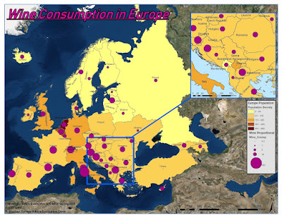
For this weeks Module 7 we were tasked with creating a choropleth map for wine consumption in Europe. A choropleth map is a themetic map in ...


